How to Use Mocha Mousse in Event Design: Pantone Color of the Year
Wondering how to use Mocha Mousse, Pantone’s 2025 Color of the Year, in your wedding, event or home decor? Let’s explore! Pantone calls Mocha Mousse, “a warming, brown hue imbued with richness. It nurtures us with its suggestion of the delectable qualities of chocolate and coffee, answering our desire for comfort.”
With a color as warm and neutral as Mocha Mousse, the possibilities are endless for how to incorporate it in event design.
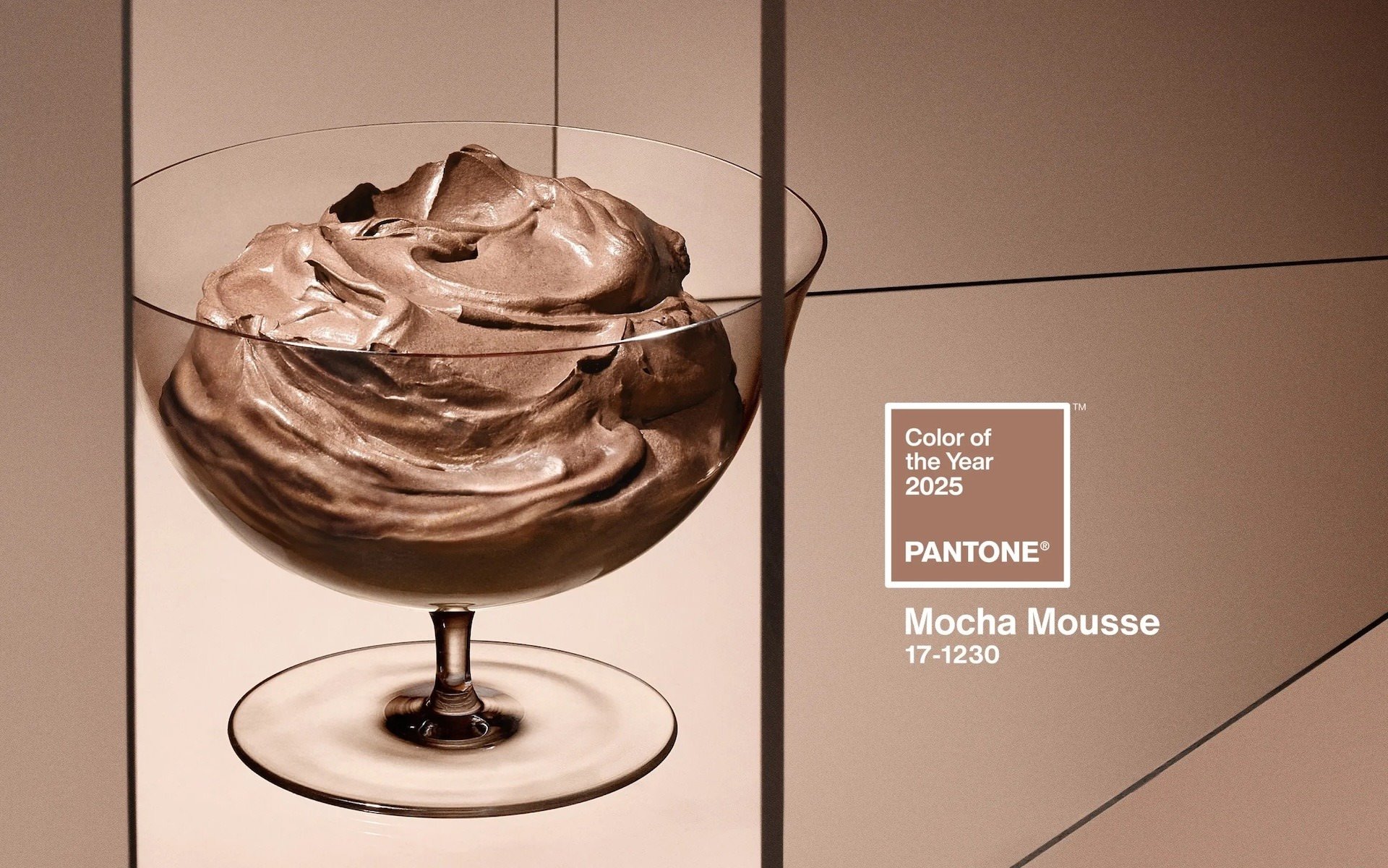

With perfect timing from the universe, and right before Pantone’s big announcement, I happened to use Mocha Mousse in November of 2024 in my designs for the amazing event, A Night at Revelry. I paired the color with rich, saturated, rosey hues, and it turns out my design palette was a perfect match to one of Pantone’s example color palettes called “Deliciousness“, seen above.
I loved the effect this color palette created! Even in a large space, the atmosphere felt so warm, romantic, and intimate.


If you’re thinking about how to use Mocha Mousse in your own wedding, event or home decor designs, here are some tips to keep in mind…
Create Your Color Palette
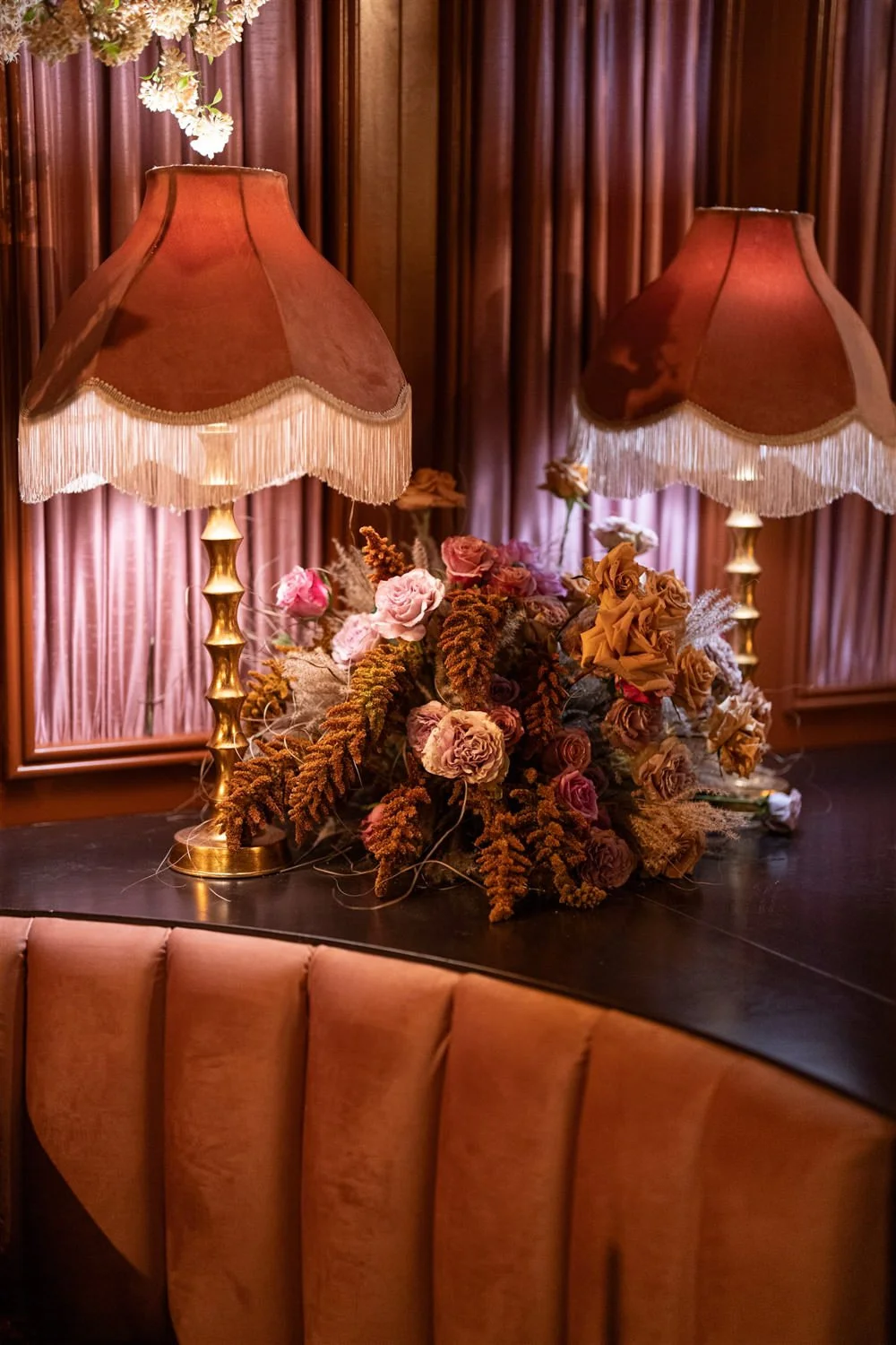
Mocha Mousse is a beautiful color on its own, but when paired with other colors it can transform! What color palette do you want to use for your design? As you can see from the photos in this post, Mocha Mousse works beautifully with soft pinks, and reds. But it works equally well in a clean, minimal palette of white, cream and beige (like in this Warmest Vanilla Fall Wedding Color Palette), in an organic color palette with creamy nude, truffle, rose and cocoa (like at this Dose of Colors Product Launch Event with Pampas Grass Decor) or in a playful color palette with accents of pastel pink, green and blue (like at this Sophisticated Bunny Themed Baby Shower).
Play with Textures, Not Just Colors.
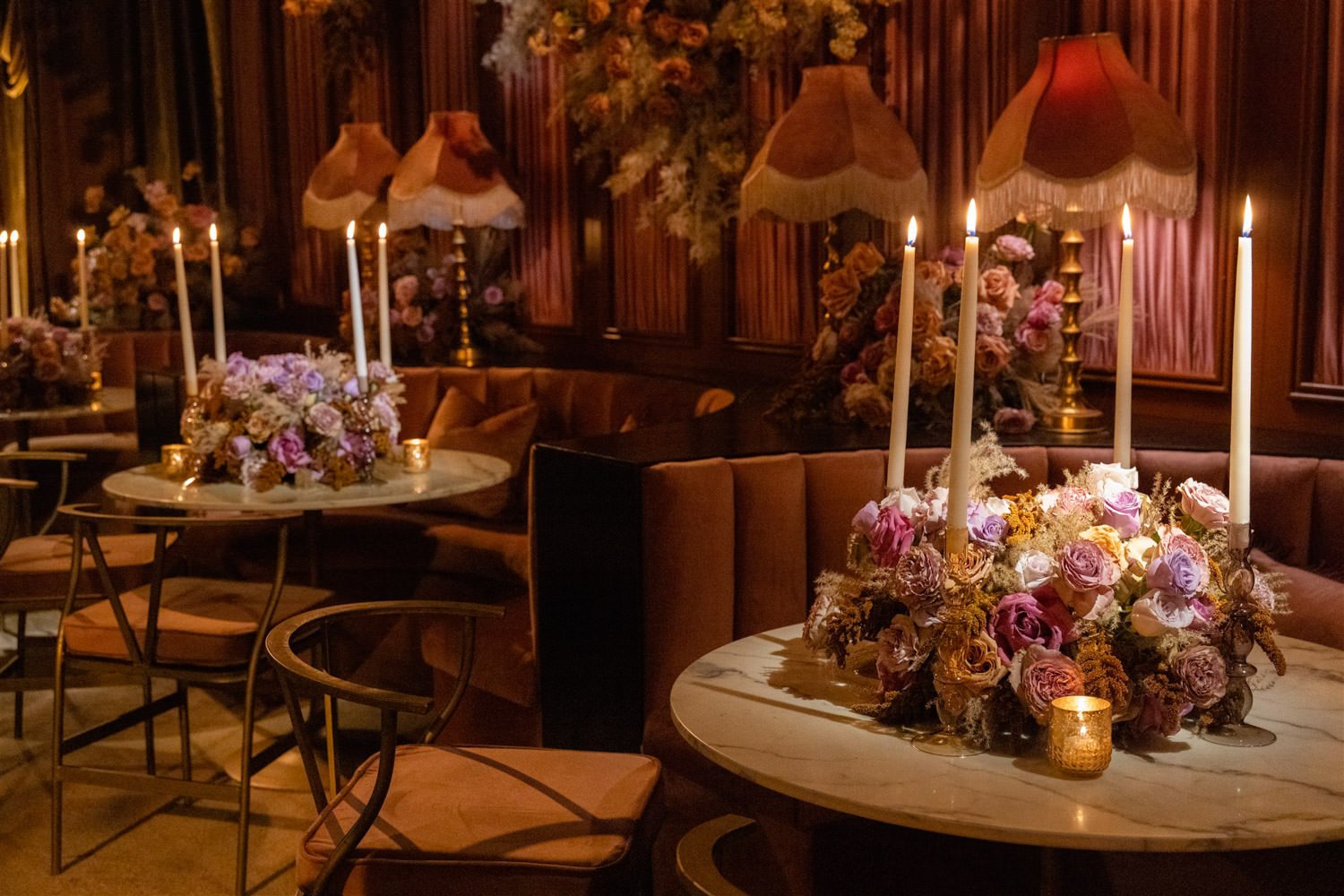
The texture of your design elements are just as important as their color. Texture adds interest and allows your eye to take in layer after layer of detail, and when multiple different textures are combined, it makes a room feel warm, inviting and full of life.
To create the warm, welcoming atmosphere at the Revelry event, I made sure that soft, multilayered textures were present in every element of the room. From the folded fabric draped walls, to the velvet upholstered booths and dining chairs, to the floral arrangements overflowing with ruffled petal shapes and feather-like dried botanicals. Texture was everywhere!
Lighting Shapes the Space and Creates Atmosphere.
For a romantic atmosphere, nothing beats the glow of candlelight. And why is that? The color of the light is warm, the strength of the light is never too bright, the quality of the light is soft and indirect. Even if you can’t fill a room with candles you can replicate those qualities in your home or event space!
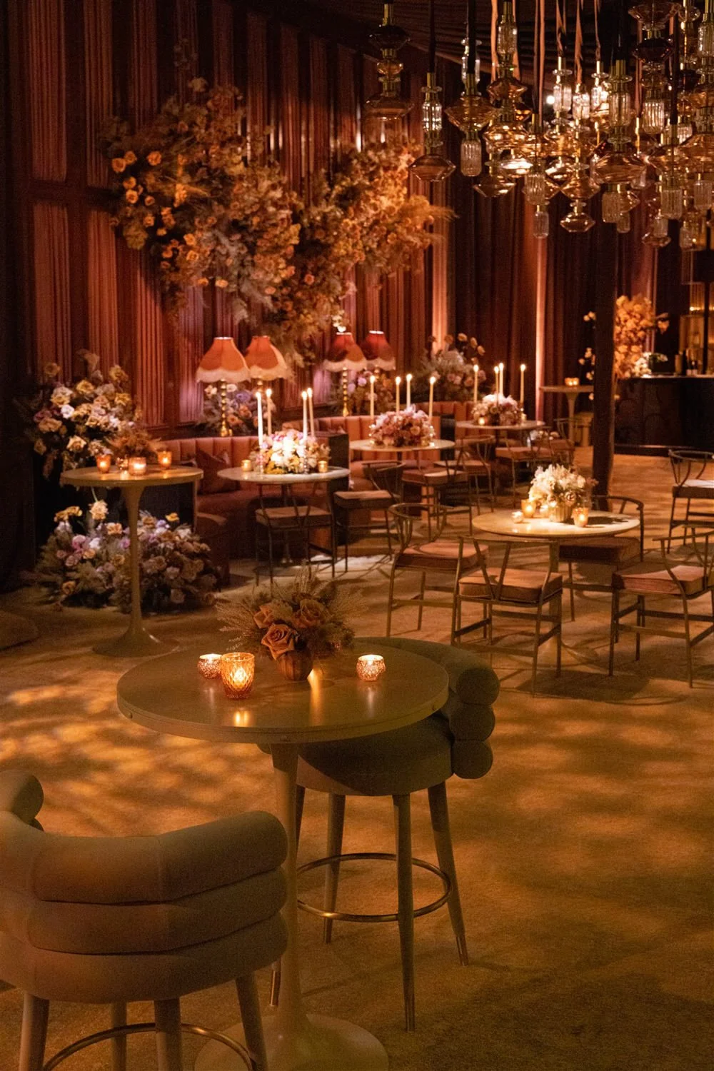
At the Revelry event, we used multiple light sources to create our environment and compliment all of the room’s decor. The fabric walls were highlighted with hidden up-lights. Dramatic groupings of pendant lights hung from the ceiling and helped define the space. Floral arrangements were strategically highlighted with spotlights. Small side lamps were tucked between our cafe tables and tall taper candles were incorporated into floral arrangements. The room felt intimate and was absolutely glowing.


Photos by Anna Anikina Photography
Love seeing behind the scenes like this?
Sign up for our mailing list and we’ll keep you in the loop with all the latest! Plus, download Eddie FREE GUIDE for florists and DIY-ers.