Event Design Tips: Making Colors Pop at an Orange, Peach & Apricot Wedding
When clients come to me with a vision for their wedding color palette, I love to get creative and dream big! For this recent wedding at the Renaissance, my beautiful clients Ani and Hakop knew they wanted an orange, peach and apricot color palette, but trusted me to envision the rest. In order to surprise and delight them, I centered my design choices around making the most of their chosen colors in clever and unexpected ways. Read on to learn about some of the design concepts I played with for this stunning rose filled wedding…
A Muted Background Helps Bright Colors Pop
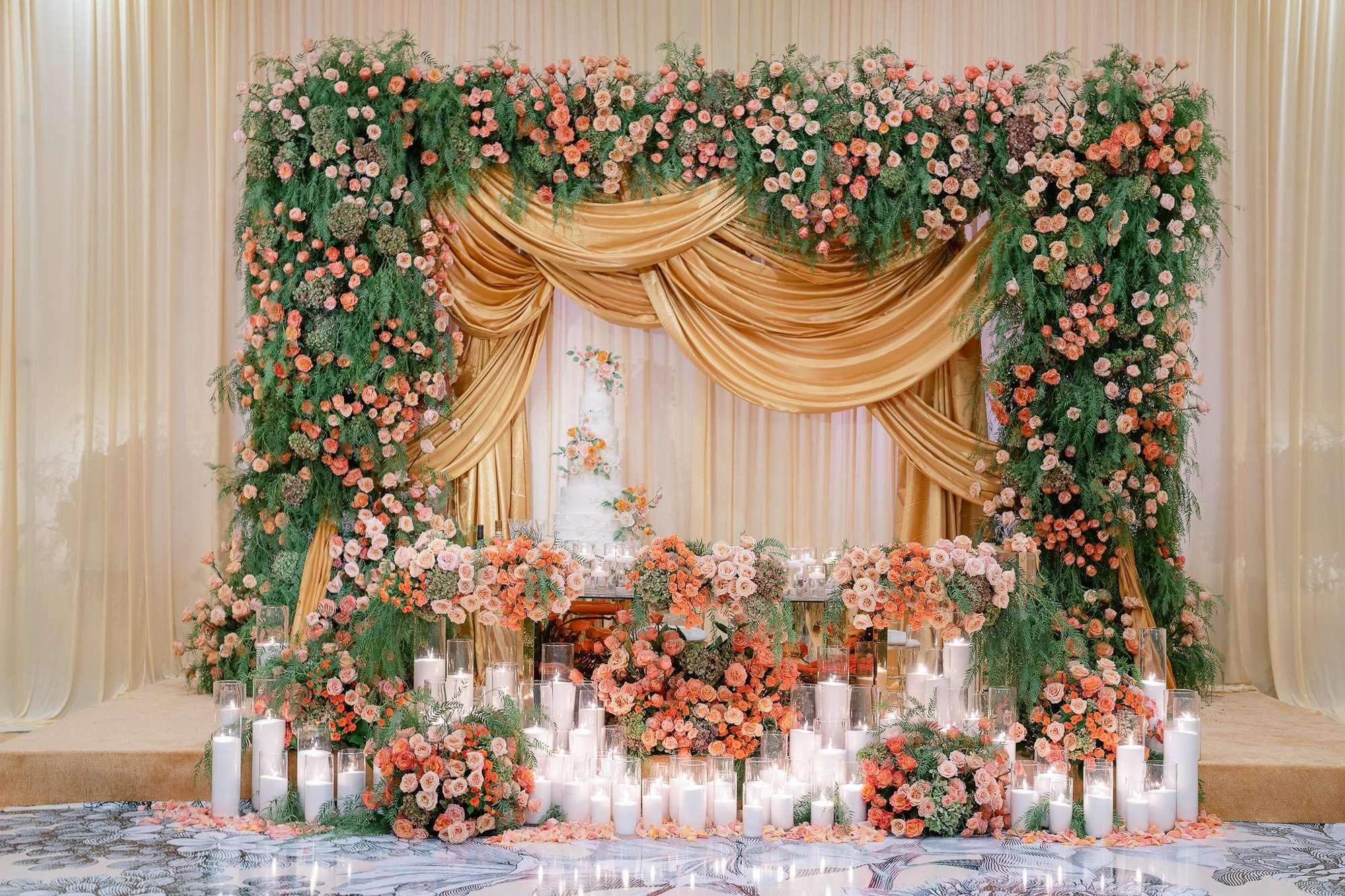
I really wanted the orange florals and centerpieces to stand out so I muted the rest of the room with draping and carpet in the perfect shade of buttercream. It created a warm, luxe, neutral palette that helped the bright colors pop.
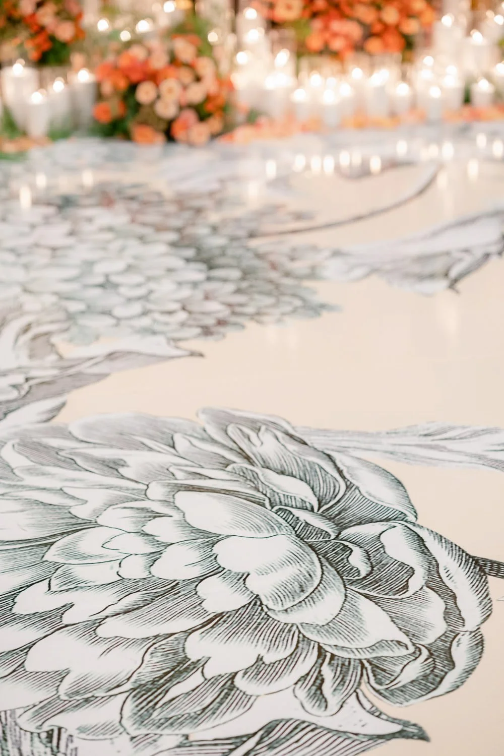
Even the dramatic dance floor remained in the neutral color family. The grey floral pattern on a cream background, added an amazing amount of fun visual interest to the ballroom while still allowing the orange florals to remain the star of the show.
Layering Textures Adds Interest and Depth
Layering multiple textures throughout my design helped to fill the large ballroom and make the most of the space.
The smooth weight of the soft cream table linens and buttercream and gold fabric draping contrasted beautifully with the look of the overflowing florals. I made sure each arrangement was full and lush, containing a mix of colorful roses, garden roses and spray roses, with texture from antique hydrangeas and green pepperberry leaf foliage.
On the table tops I alternated gold wire cages and thin gold candelabra stands to hold the tall centerpiece florals, and on the tables at the back of the space I used sleek, modern, clear glass candelabras.
And who could miss the the fabulous oversized floral pattern on the playful dance floor!
Repeating Design Elements Creates Unity and Rhythm
With so many textures and rich colors, I repeated elements throughout the space in order to maintain a sense of unity, rhythm and flow.
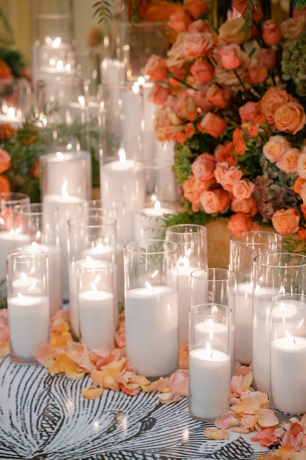
The floral pattern on dance floor was also used on the seating chart and in the table numbers. The clear glass look was echoed in the amber colored Napoleon ghost chairs, the clear modern candelabras, the acrylic platforms beneath the gold cage floral centerpieces, and in the candles clustered in front of the sweetheart table.


