Designing Events with a Bright & Bold Color Palette
Designing with COLOR is like food for my soul, so I loved creating the florals for this bright and colorful rehearsal dinner at the Santa Barbara Zoo. Inspired by a lively but laid-back hacienda ambiance, the evening was filled with personality, energy and a welcoming atmosphere. What better way to help my clients and their guests begin their weekend of celebrations!
Ready to Decorate your next event with bold and Bright COLOR? Here are my top tips for doing it right!
Balance Brights with Organic Materials & Textures
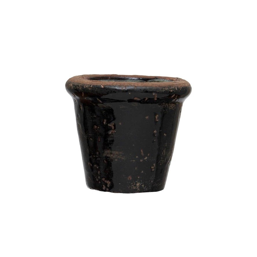
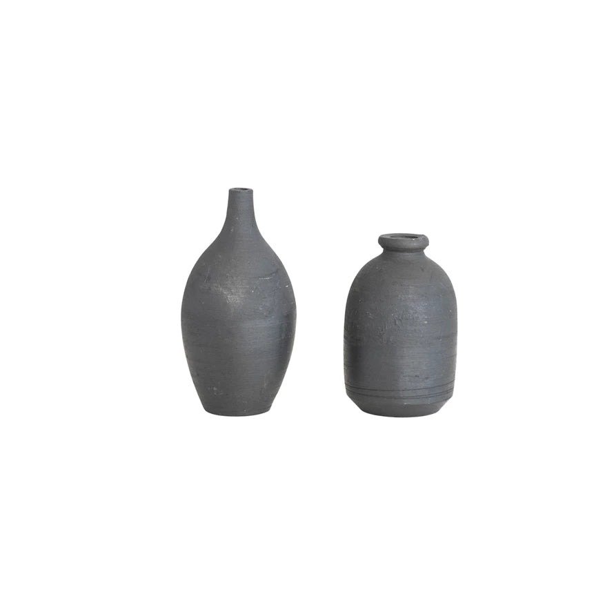
From our striking wood dining tables and bar to the rattan chargers at each place setting, neutral and organic light wood tones balanced this bright color palette beautifully. Using dark ceramic and stoneware vases for the floral centerpieces also grounded the arrangements and added a great foundation to the color palette.
Create Single Color Arrangements
To keep the look of this bright and colorful rehearsal dinner chic and sophisticated, I grouped blooms of the same color into each arrangement, and often used a single variety of flower in each vase. This kept the vibrant, colorful look from feeling cluttered or confusing to the eye. When I did create arrangements that mixed and matched multiple colors and blooms, they stood out as special and purposeful rather than the norm.
Use Multiple Shades of a Single Hue
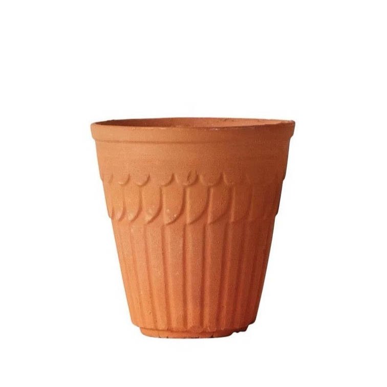
To add depth to your designs, try incorporating multiple saturations of a single bright hue into your decor or floral arrangements. As an example, the fabulous terracotta vases that acted as a seating arrangement displays were filled with orange ranunculus, but not just one shade of orange - they ranged from bright, saturated tangerine to salmon to pale peach, and ensured the look felt lush and alive.
Photos by Jose Villa
Love this look? Shop EZLD.co to recreate it!
Join the List!
Receive updates, articles and new product releases by joining our mailing list, and get Eddie’s FREE Guide to his Top Tips & Materials!


