Wedding Design Inspiration: Adding Dimension to a Heavenly All-White Wedding
The design process for Anee and Onick’s wedding was truly unlike any other. After working together on their bright and colorful bridal shower, the couple was so delighted with the result that they simply handed over the reins to me for their wedding design. They loved what I created and told me they trusted me entirely to design their wedding and make it a surprise! Until their wedding day, when they walked into their reception at the Taglyan Cultural Complex, Anee and Onick had no idea what my team and I had created for them. There were happy tears all-around, and they even got me teary-eyed seeing their response!
When considering Anee and Onick’s wedding design, I was so inspired by the couple’s personalities, and especially by Anee. She is bright and kind and has an angelic quality to her that is incredibly special. Her bridal shower had been all about fun colors and floral prints, so this time I wanted to create the illusion of walking into heaven. Using an all-white color palette, I built an ethereal wedding reception environment that truly felt other-worldly.
Working with a single color palette, whether it’s white or any other color, the trick is push yourself outside your comfort zone and ask, how can I add interest to my design? With color off the table as a tool, what else can you use?
Here are three ways I added character and dimension to this sparkling, heavenly, all-white wedding:
I Mixed Fresh, Dried and Faux Flowers
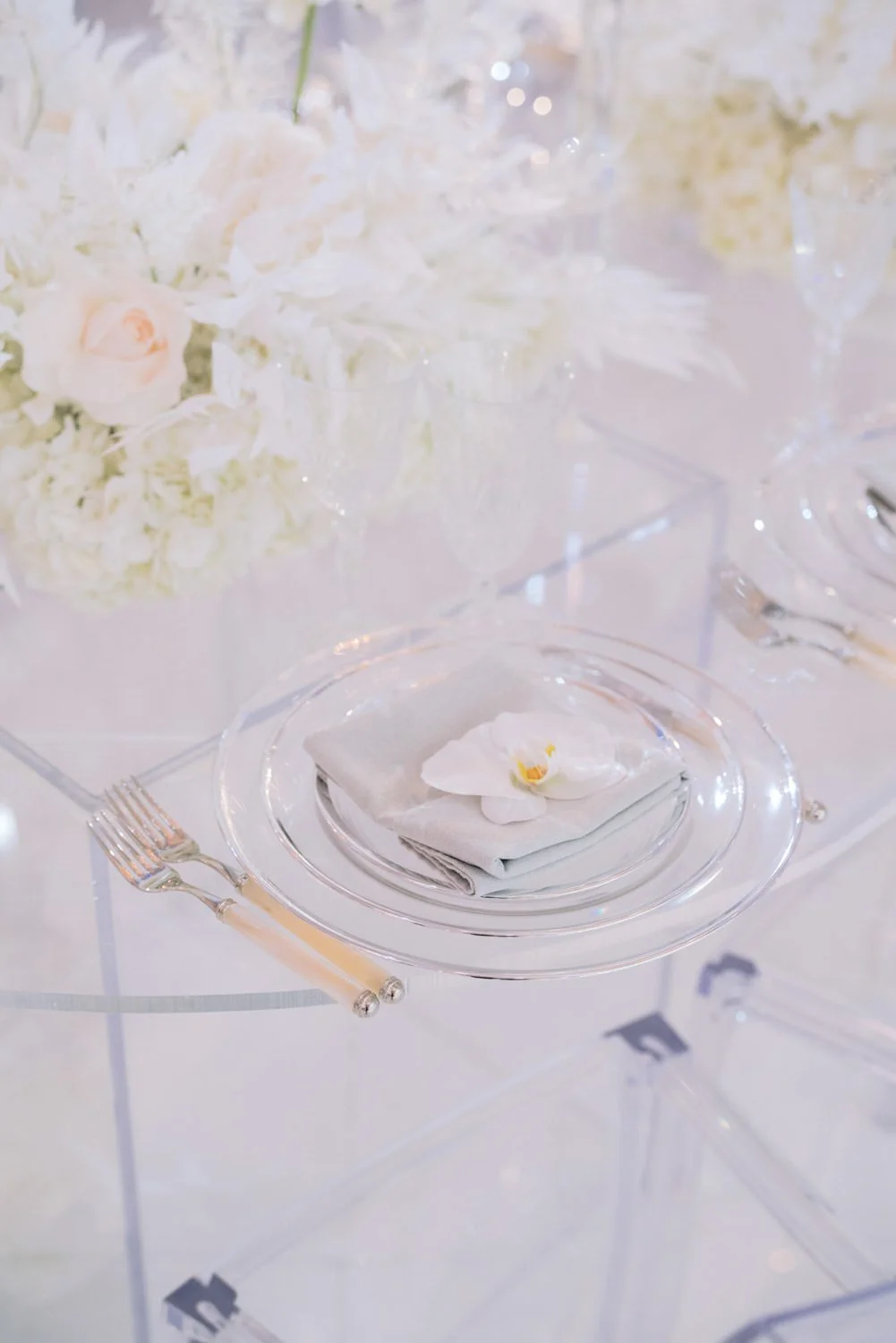
There are only so many all-white flowers that grow naturally, so in order to create the look I wanted, I got creative with my materials and used a combination of silk, dried AND fresh flowers. Preserved and faux botanicals can be an incredible addition to your arrangements, filling in those gaps that mother nature doesn’t already supply, or that aren’t in season. The arrangements here included all white preserved amaranthus, faux greenery, and fresh roses, hydrangea, peonies, lisianthus and orchids.
I Varied Shapes and Surface Textures
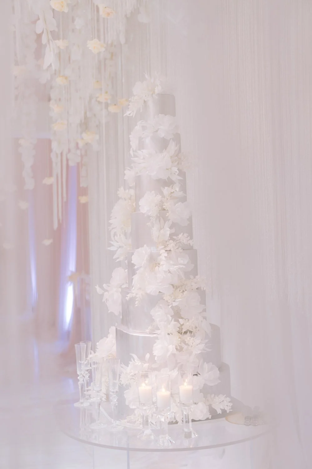
To add depth to a single color palette design, you need to use other elements besides color to add dimension and interest. Without it, the eye won’t know where to go and the room can fall flat. For Anee and Onick’s wedding I really played up multiple surface textures. Between the sleek transparent lucite tables and chairs, the cut crystal glassware and chandeliers, the soft grey table linens, the mirrored accents, the billowing fabric wall draping, and the flowing floral arrangements, everywhere you looked there were contrasting textures that complimented each other and amplified their effect.
The table shapes were another way that I added dimension to the room. The majority of the dining tables were round and covered in beautiful pale grey linens, others were long lucite ovals which seemed to float in mid air, and two dramatic tables were large, custom made squares that anchored the space with their sharp angles and geometric shape.
I Used Purposeful Lighting
One of the most important details to consider when designing with a single color palette, is that your lighting needs to be on point! Lighting can make or break an environment, so consider carefully how you can use its quality, direction, intensity and color to your advantage. And don’t forget candlelight! The warm glow of candles in clear glass candelabras added so much magic to this event.
Photos by Kris Kan
Curious about how Eddie creates such amazing events?
Sign up below to download your free guide and see all of Eddie’s go-to design tools!


