FLORAL PRINT! Colorful Decor Ideas for Spring & Summer Bridal Showers
When designing events, I always start by connecting with my clients. Their personalities, their passions, their personal styles - all of these guide the type of event I want to create for them, and the way that the event should make everyone feel. A successful event is so much more than just pretty flowers! I think of it as telling a story - one about emotions, relationships, and unique lives of those we’re celebrating.
When I first met my clients Anee and Onik, Anee and I bonded over fashion and style right away. I envisioned a spectacular all-white wedding for them, so when it came time to design her bridal shower I wanted to create a look that was completely different. Anee showed me the dress she planned to wear to her party, and with its modern shape, clean lines and pale pink color, I knew that the perfect way to compliment her look would be with layer upon layer of color and pattern in the party decor. Beautiful Anee would be highlighted perfectly!
Another benefit to this design approach was the way it would fill the event space. The bridal shower was going to be a small gathering at Veranda Restaurant in Glendale, CA, so I used colors, prints and textures to make the party feel full and abundant, and to give this small event BIG impact.
DESIGN TIP: When working with small areas, or limited budgets, utilizing busy prints can add a lot of interest without a lot of extra cost.
On the tables I used amazing floral print linens, and then repeated the same colors and flowers in the floral centerpieces. This created a dramatic effect where the pattern from the linen was repeated in 3-dimensions. The combination of the two layers added so much fullness to the room.
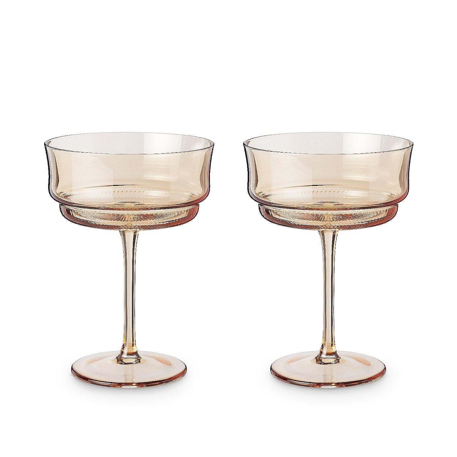
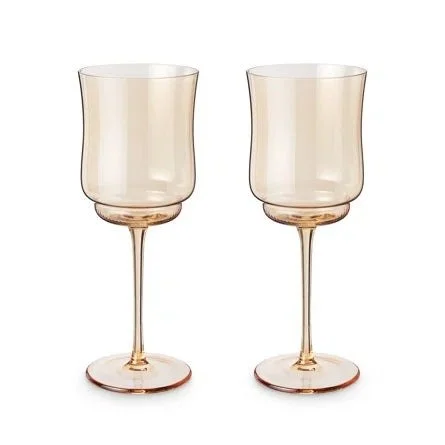
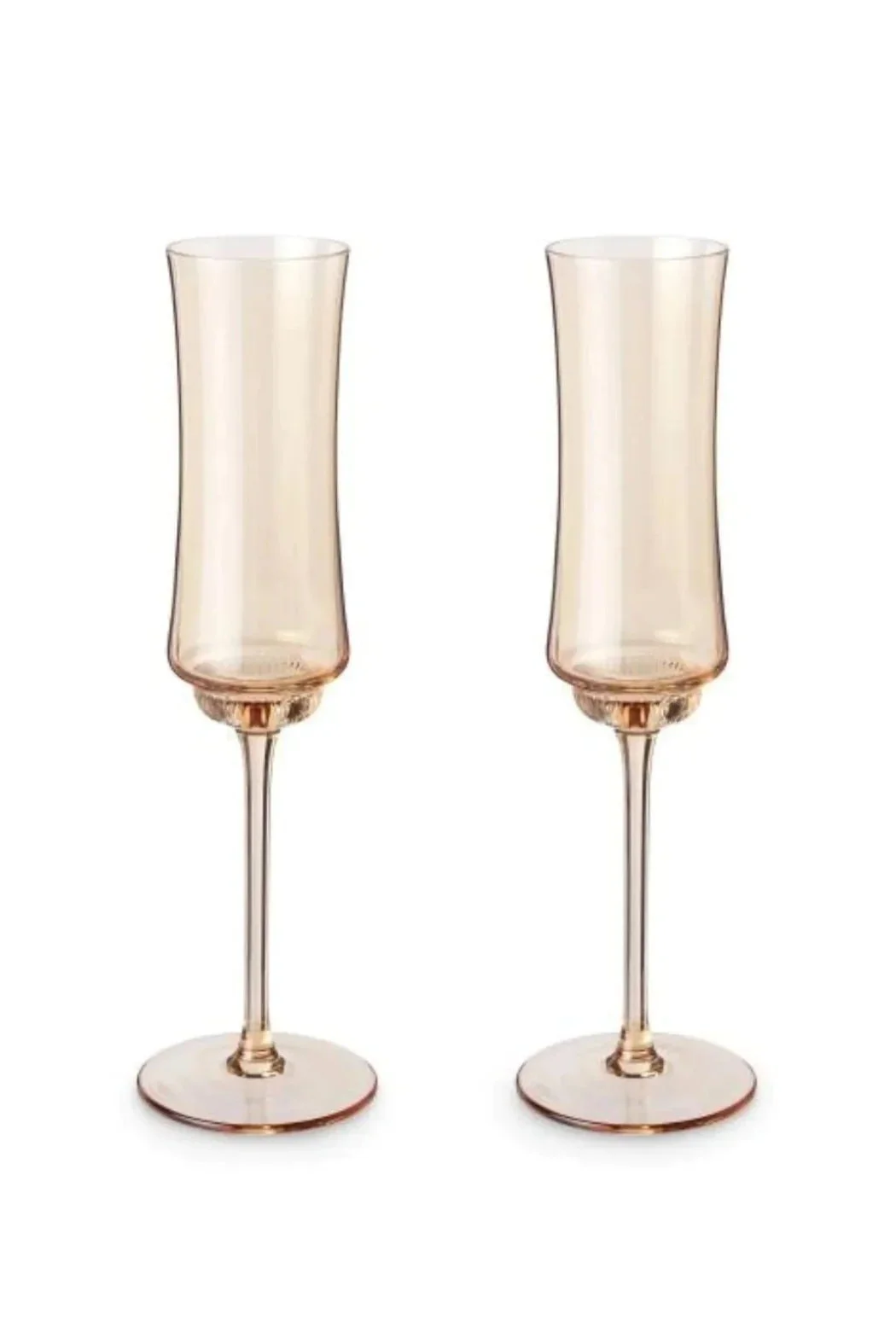
The table settings and tabletop accessories were all in muted, warm, amber hues. I wanted them to be neutral and elegant additions to the table, but still contribute a little bit of color. Using clear crystal glassware or white place settings would have felt too stark and cold.
DESIGN TIP: Neutrals don't have to be white, gray or beige! Play with different color palettes and color temperatures to find the right "neutral" addition to compliment your designs.
At each place setting, a fluffy pink peony bloom perched on top of folded floral print napkins. And at each table there was a single table number painted a vibrant blue-green.
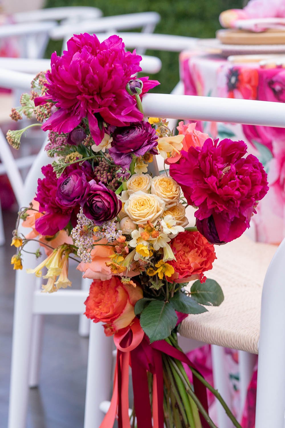
A floral chair back decoration was the perfect finishing touch at the seat of the guest of honor. They were made from peonies, ranunculus, yarrow and spray roses, and tied with deep red and coral colored ribbon.
To give the room a focal area, we constructed a hand painted wall draped with florals. The arrangements here used the same flowers as the table centerpieces, but instead of being tightly packed and perfectly shaped, the wall's floral arrangements were loose, flowing and organic. The wall acted as a backdrop for the cake as well as for group photos and selfies throughout the party.
DESIGN TIP: A single large focal point in the room can create a lot of visual interest and serve multiple purposes!
Anee and her guests were blown away by the look and feel we were able to create for this intimate event, and I just love the way it turned out. It's so much fun to flex my creative muscles and find design solutions that work, and wow my wonderful clients.
Photos by: Kris Kan
Shop the Look at EZLD.co!
Want more design inspiration from Eddie?
Join our creative community below, and download a FREE GUIDE filled with his favorite floral tools and materials!


